Thursday, 23 April 2020

Final Submission


This is a selection of my best work over the past 6 weeks. I was a lot
more successful at crafting and photographing my models than I was at
 digitally rendering and drawing. Below is a copy of my 100 word statement:

A space for two:

Through model making, digital fabrication and photography I aimed to communicate a space with both room for shared living and individual reflection. I have experimented with the shape of space and the natural lighting to enhances these two aspects. This is evident in my final model as the sliding door with the curtain creates a soft glow in the collective space, whereas the two thin windows near the ceiling provide light to the individual spaces. I was successfully able to communicate my intent through modelling and photography however the digital fabrication was not as successful.


Tuesday, 21 April 2020

Fusion Initials


My Initials are STG for Samantha Tyler Goodsell. When creating these in fusion I had to change the shape of each to allow it to work. Creating a shape that transformed from T to G was quite difficult which is why my letter G is very stylised.


When I transported my file to a STL file it did not carry across my material finishes so I have included these images here. I had fun playing around with the different materials and their effects. I used colour combinations and materials that I felt represented me in some way.


Monday, 20 April 2020

Fusion model to Illustrator laser cut file


This is my transitional space. It is the space that connects to my room I have been focusing in for this assignment. It is a space for stairs providing a transition between one floor and the next. 
When transferring this to illustrator I struggled a bit to fit all my pieces into the given size restraint but after a bit of fiddling I managed to make it work

Week 9 Interior Final model


Whilst working at the scale of 1:50 proved easier to craft and assemble it did bring up some challenges. Photographing the inside of the model was difficult due to how small the model is. Also because of the size small amounts of light seeped through the edges and corners where the card didn't quite meet where it should. However I don't think this impacts the 
communication of where the light should be too much as it is 
still clear where it is meant to be.


Week 9 Final Model

Final Model


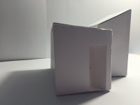
To create this model I used white card and a scoring technique. Instead of folding Like I did with the paper model I lightly scored the car with a boxcutter, then folded along the line. This prevented creasing and created a more crisp edge. Once again I worked at the scale of 1:50. This scale is rather small for my model however I have decided that it was better to work at as the card was able to hold its shape easier. This scale is also better for me as I am an interior student and this scale is very common in my course.

Sunday, 12 April 2020

Week 8 Photoshop

My photoshop skills are limited and I had a rather difficult time putting this together. I think sometime in the future I will partake in some online tutorials to further develop my skills.

Development sketches

This first photo is of the sheet of paper I was
using to record the measurements of my space

I then documented this is my visual diary and
drew a quick sketch of my space 3dimensionally.
 I also noted down what I wanted my space to do.
This is when I started exploring changing the height
of one side of the space and adding an additional
platform inside.
I then decided to add additional light sources. the first
being in the change of heights in the ceiling. I thought
about where light would be and where the dark spaces
 would be.
Here I have decided the adjust the height again
 to further explore the shape of the room and
to allow more natural lighting into the space
Here are two quick sketches of what I plan to model now from two 
different perspectives